GINZA KUKI by plastac
Japanese Restaurant | Tokyo, Japan

GINZA KUKI | plastac | photography : Nacasa & Partners
DESIGN NOTE
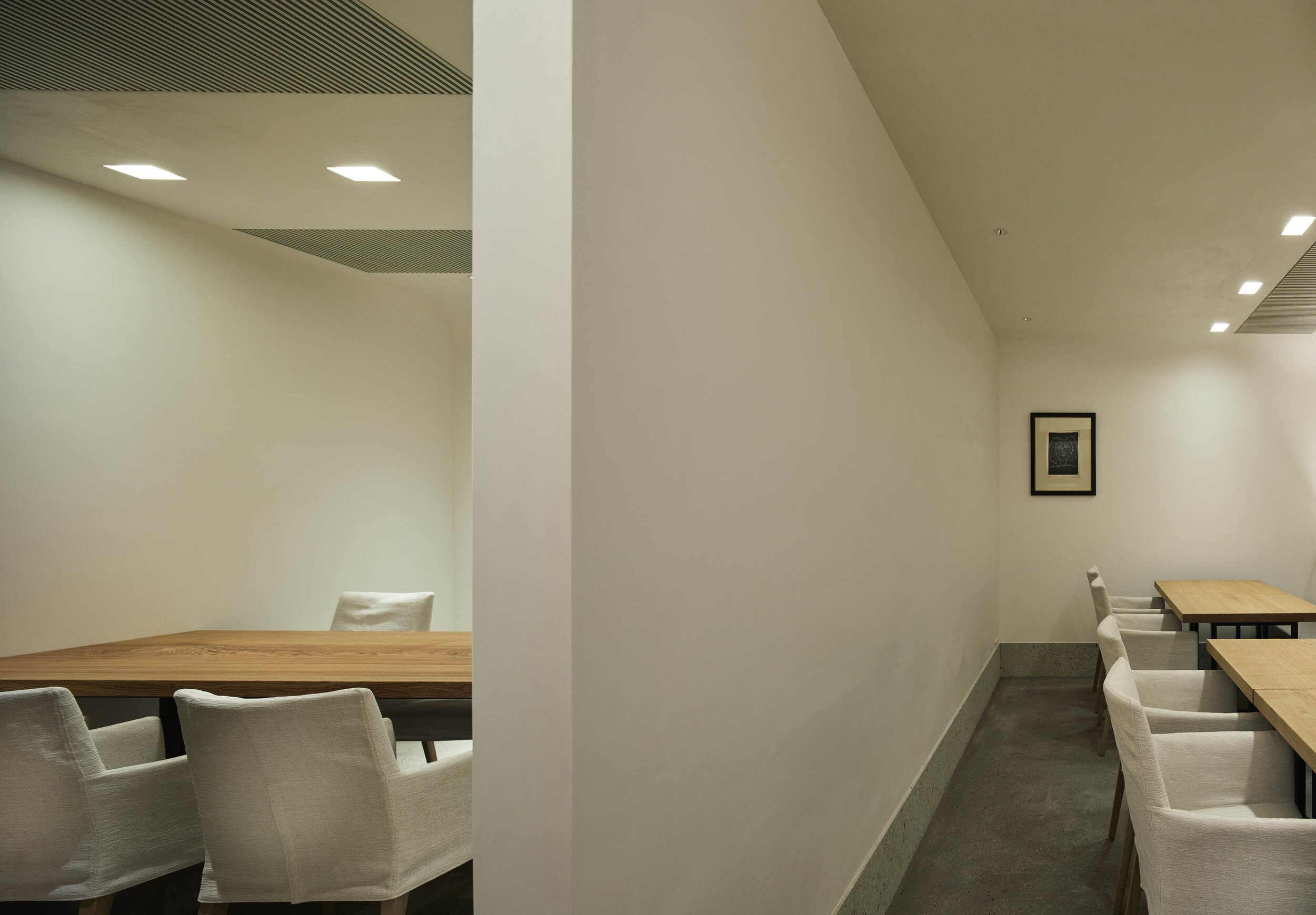
a Japanese restaurant with a minimal colour palette
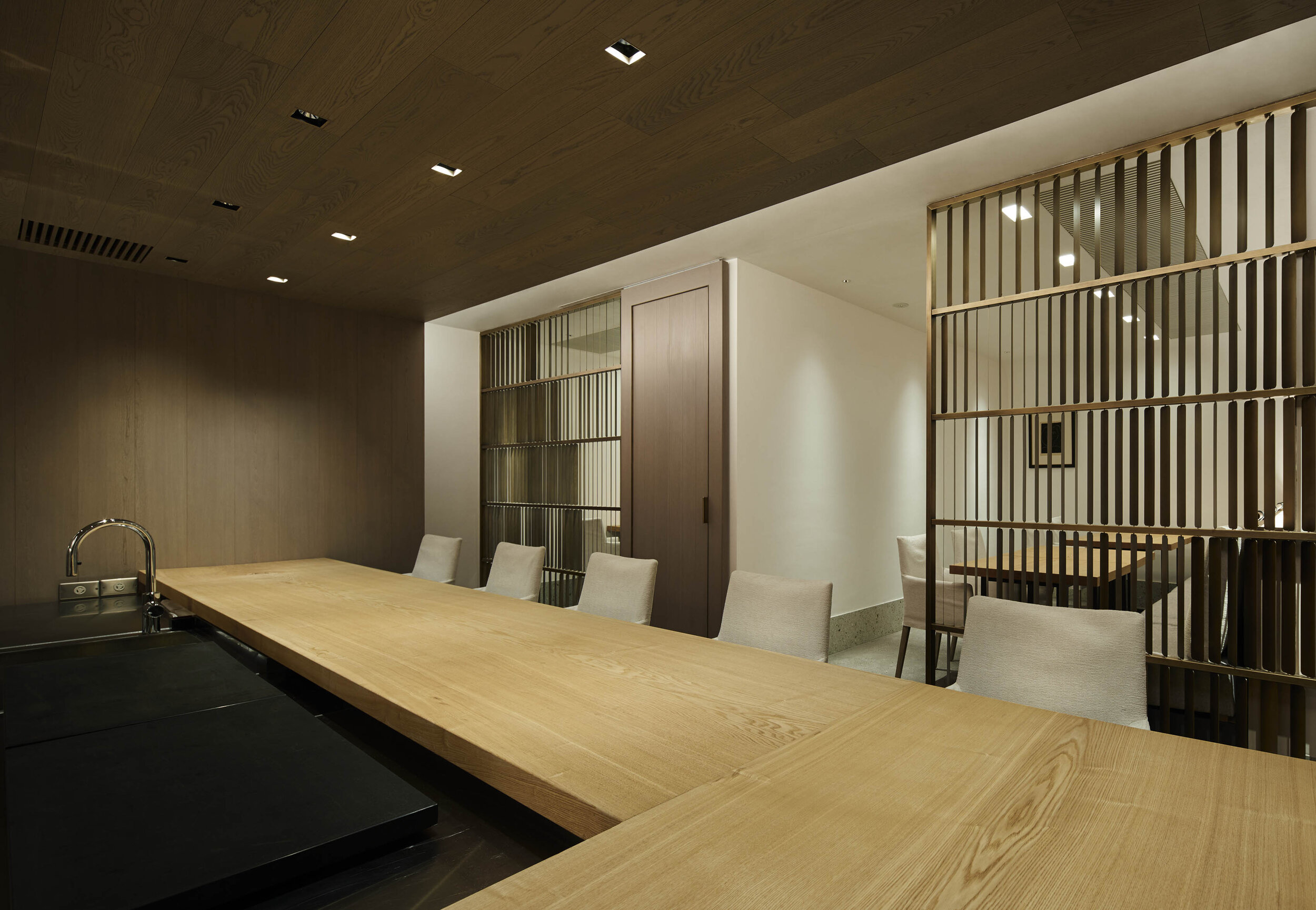
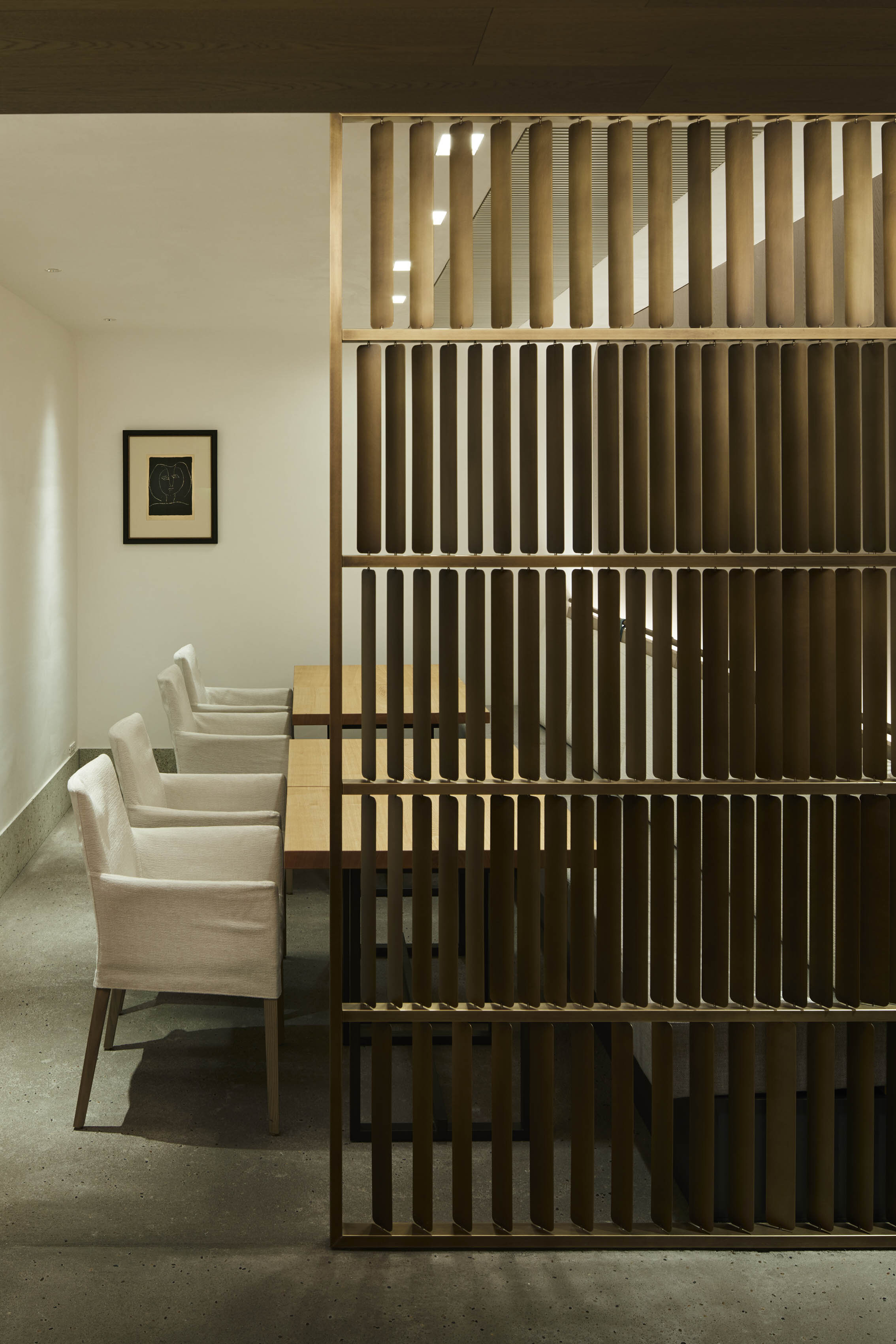
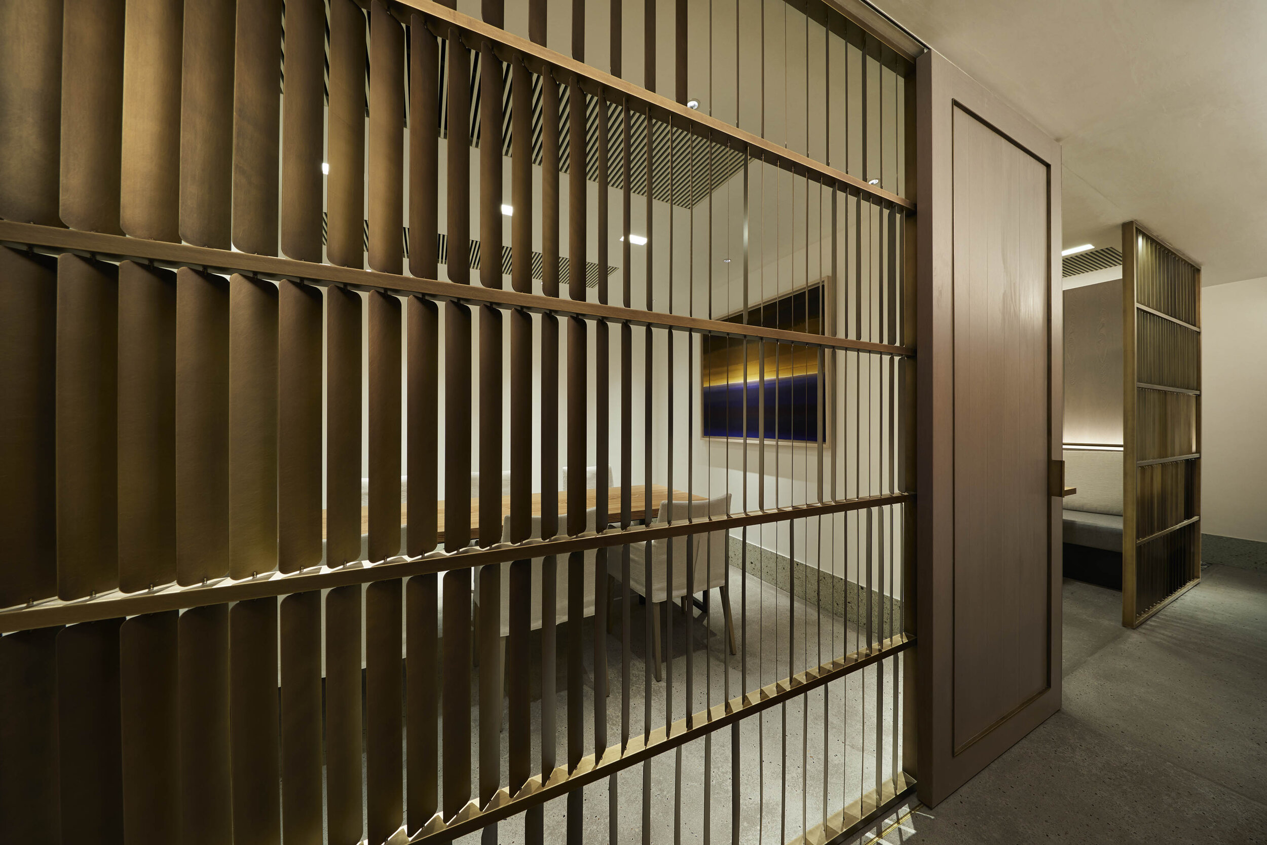
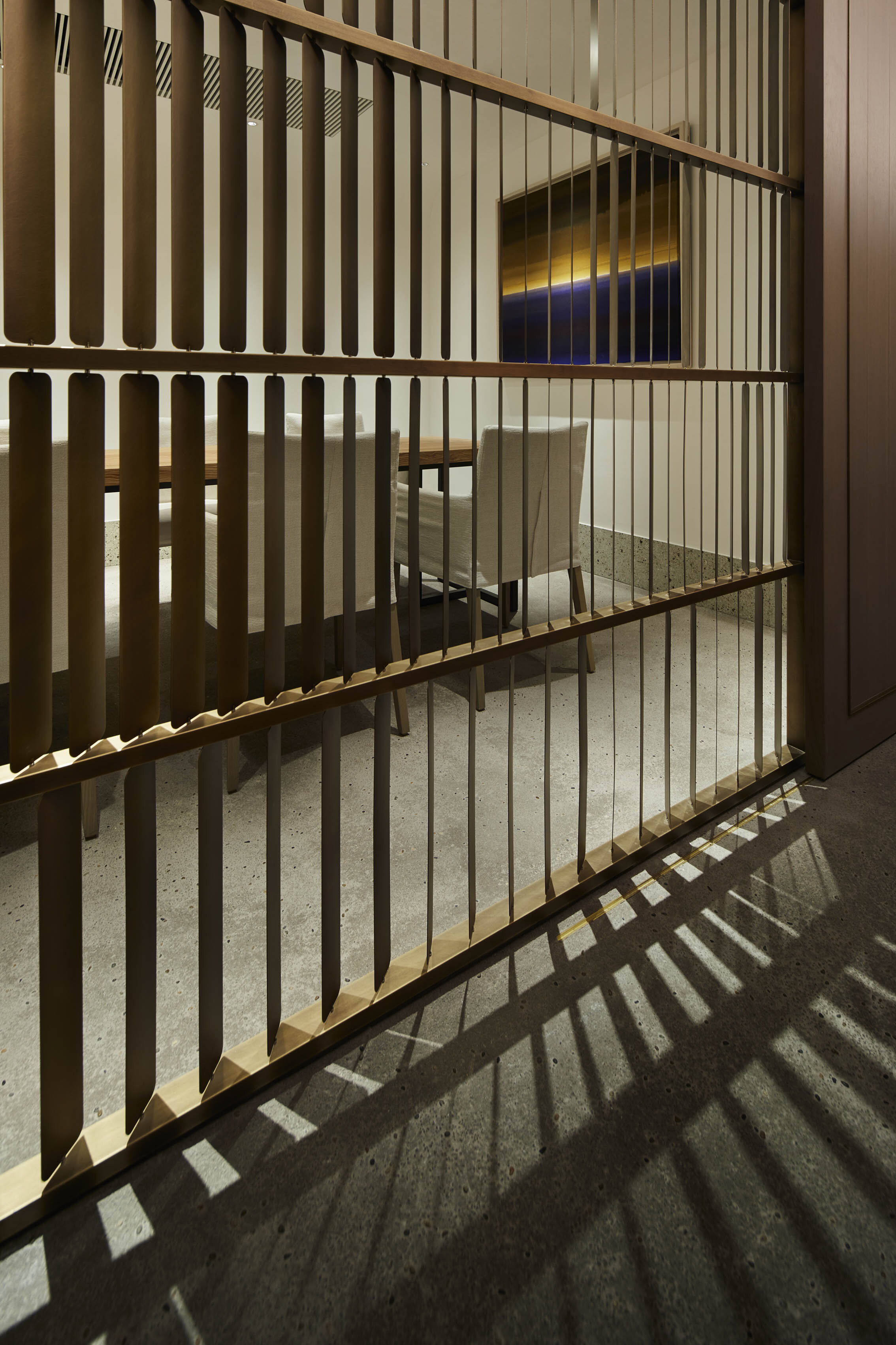
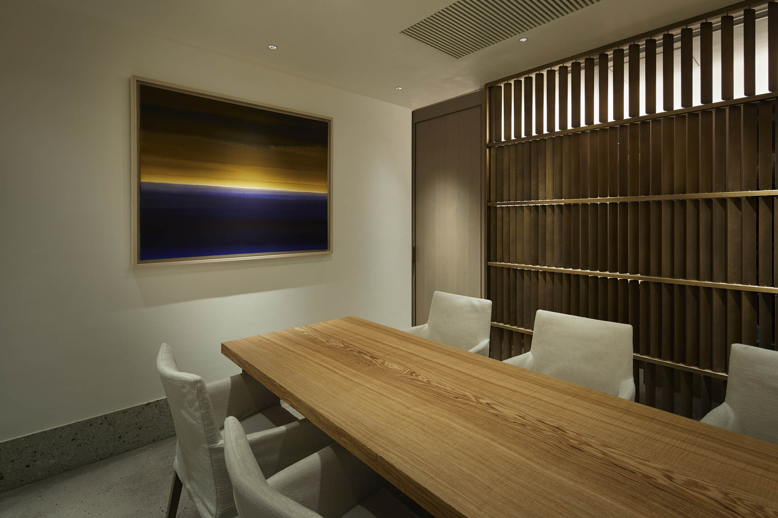
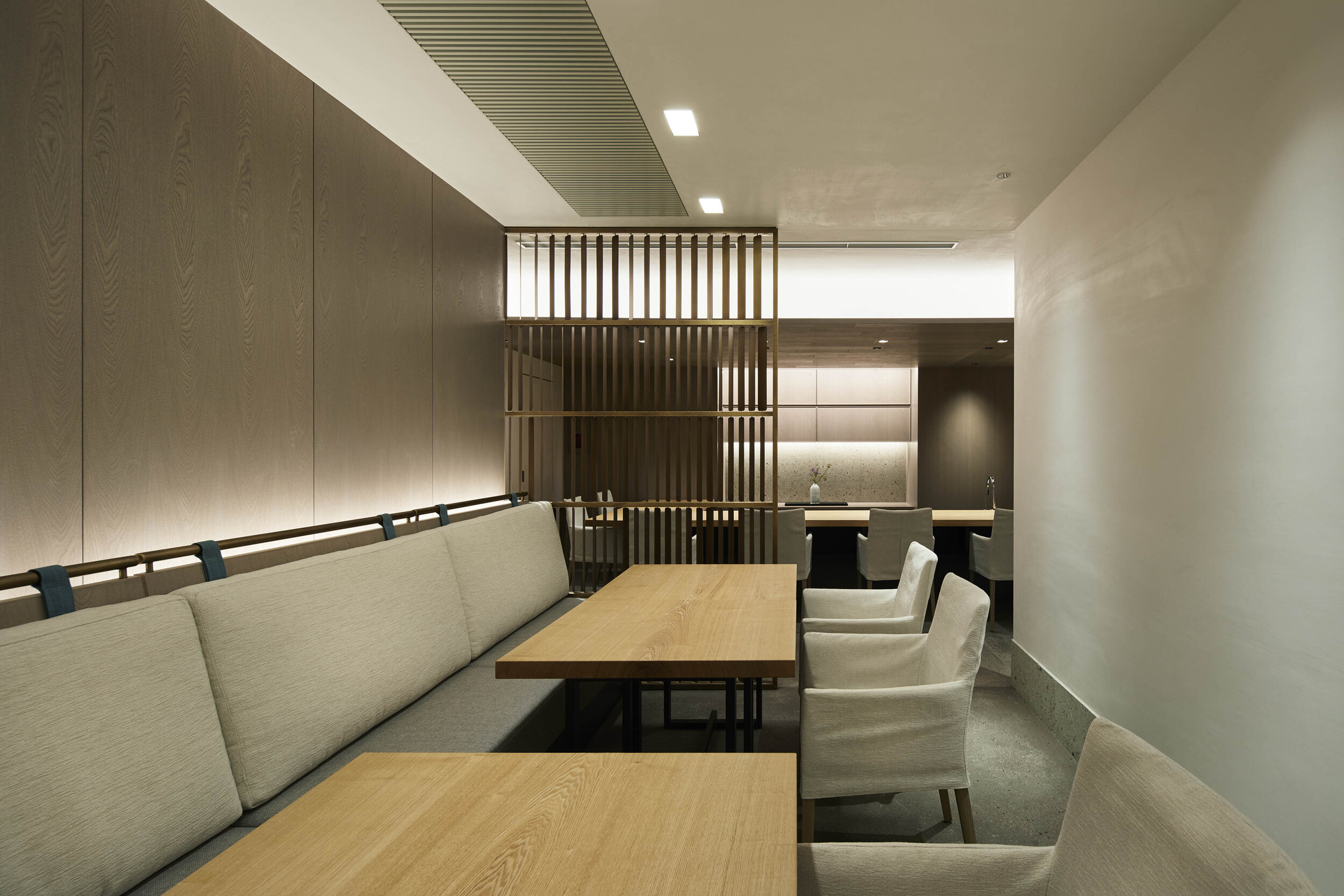
Sophisticated, custom-made partitions with movable slats
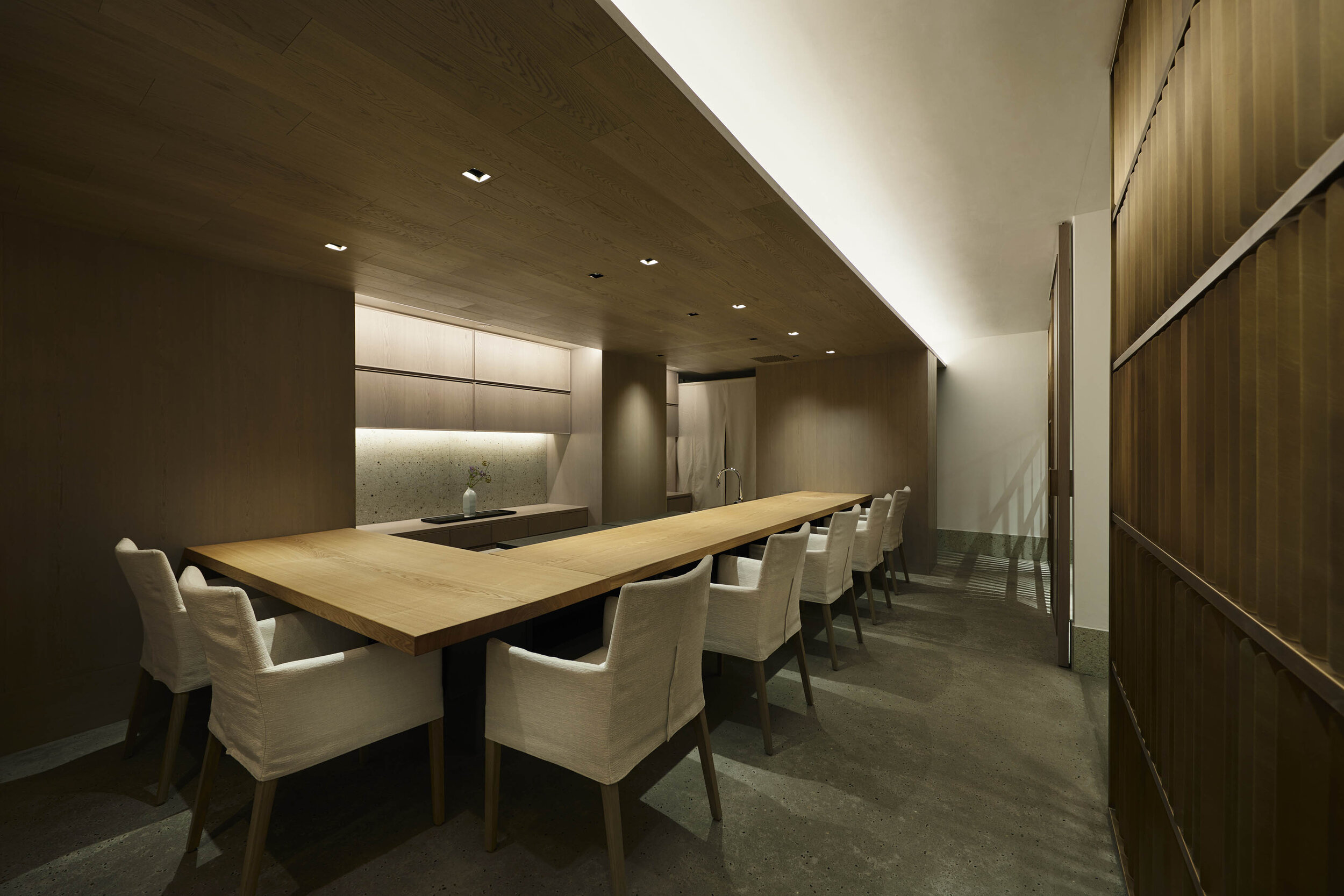
Clean and simple ceiling with concealed ac units

photography : Nacasa & Partners
words : Reiji Yamakura/IDREIT
Tokyo-based design studio Plastac has designed a Japanese restaurant GINZA KUKI in Tokyo. The restaurant is run by Hikari Miso, a long-established miso company, and its menu is based on the theme of fermentation and maturation. The restaurant's name is derived from Kuki, the origin of miso.
When we asked the designer Atsuko Oku about the initial concept, she replied: “ We aimed to create the best, most comfortable, Japanese space we could design, with authentic materials and delicate details. Because we were not expected to imitate traditional Japanese architecture.”
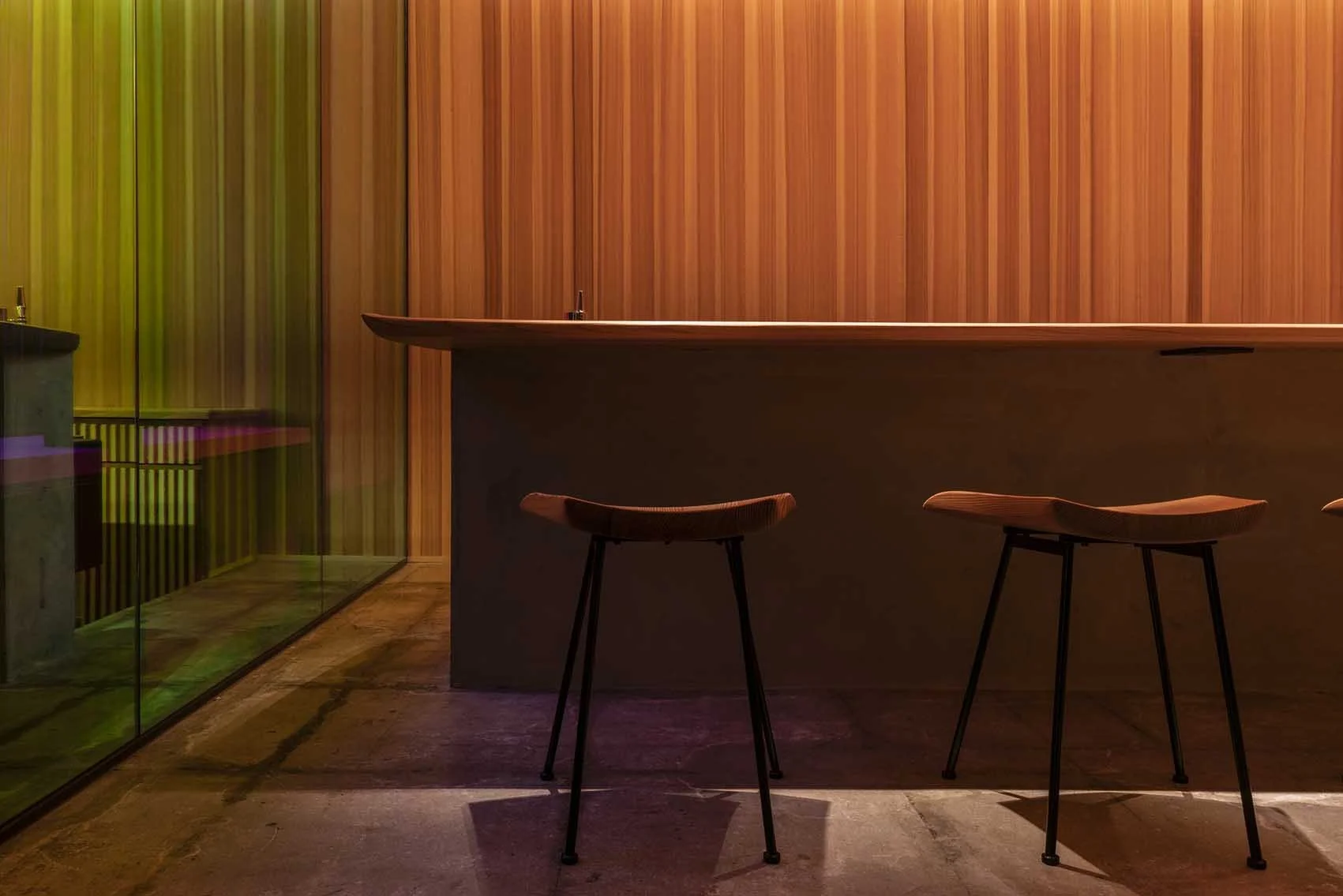
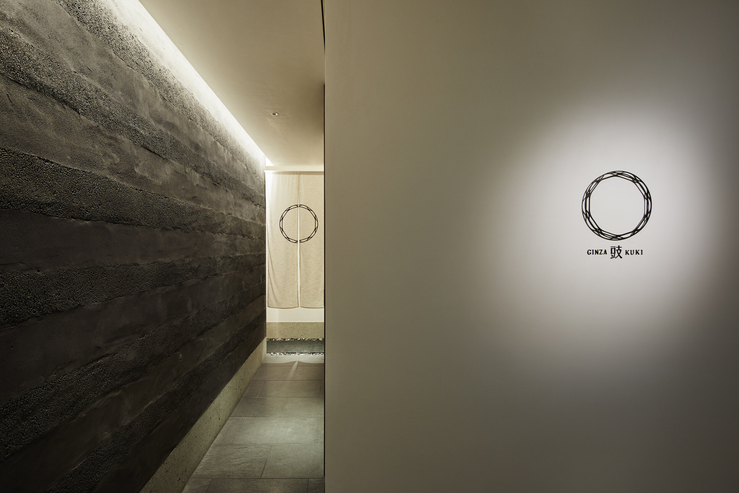
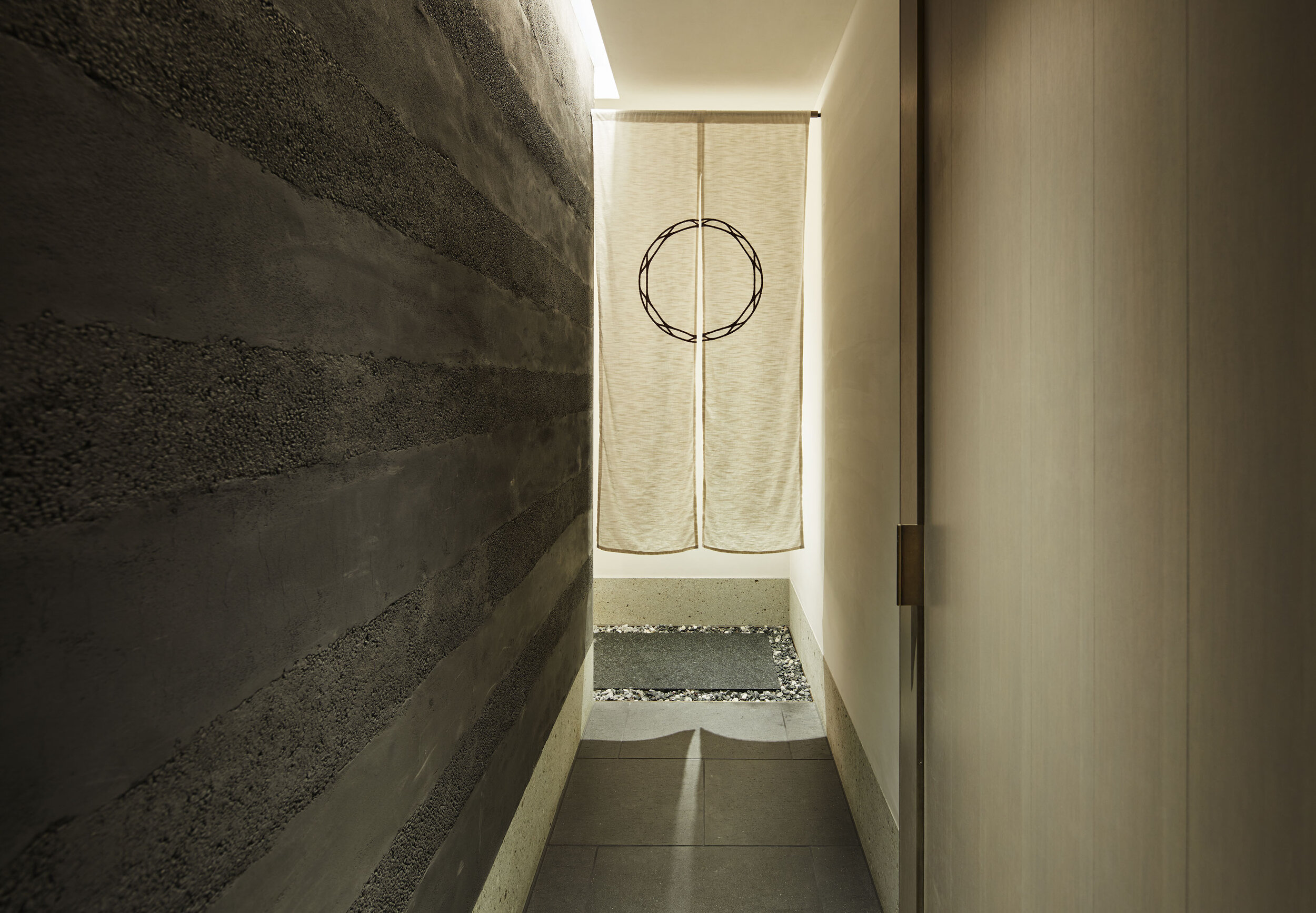
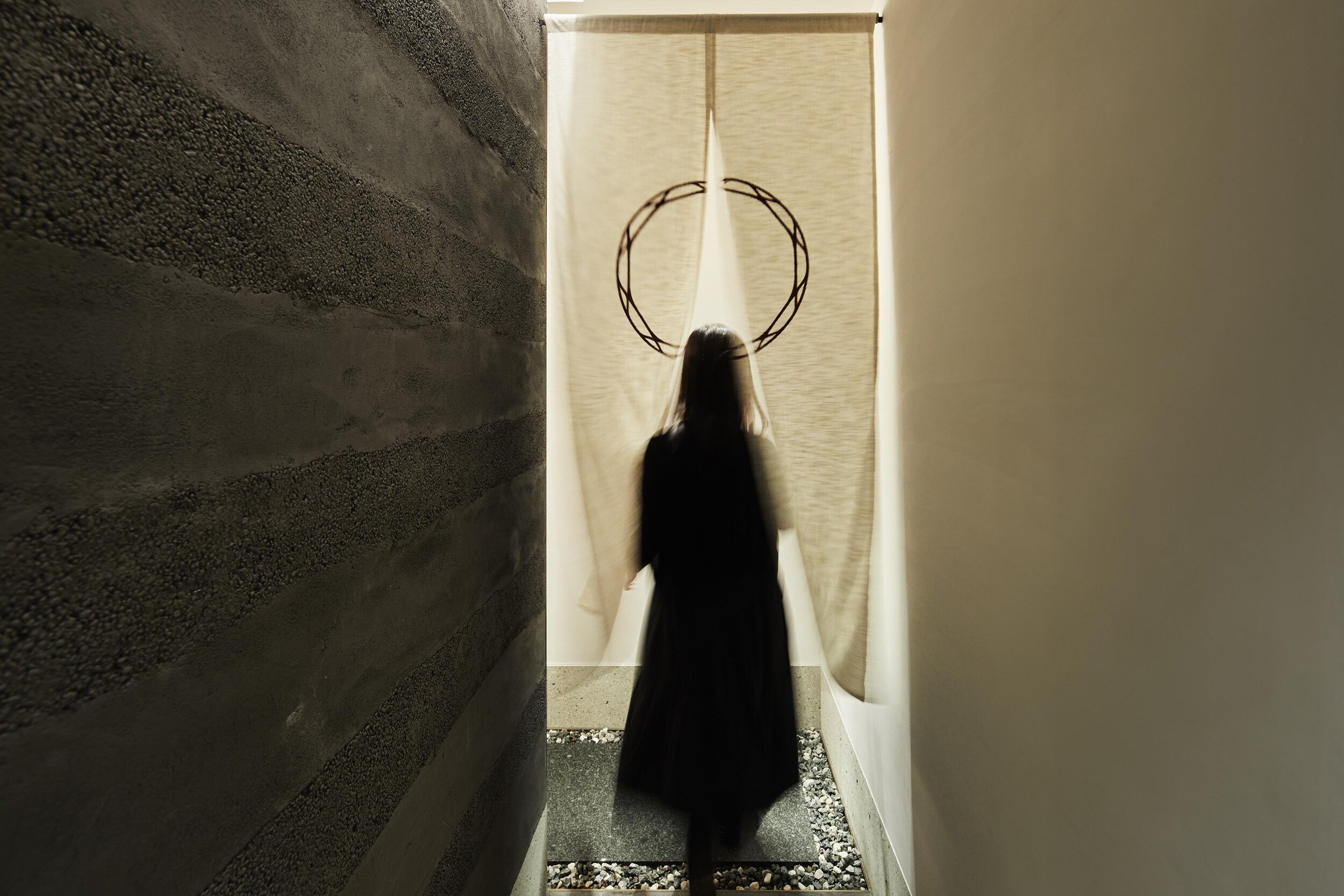
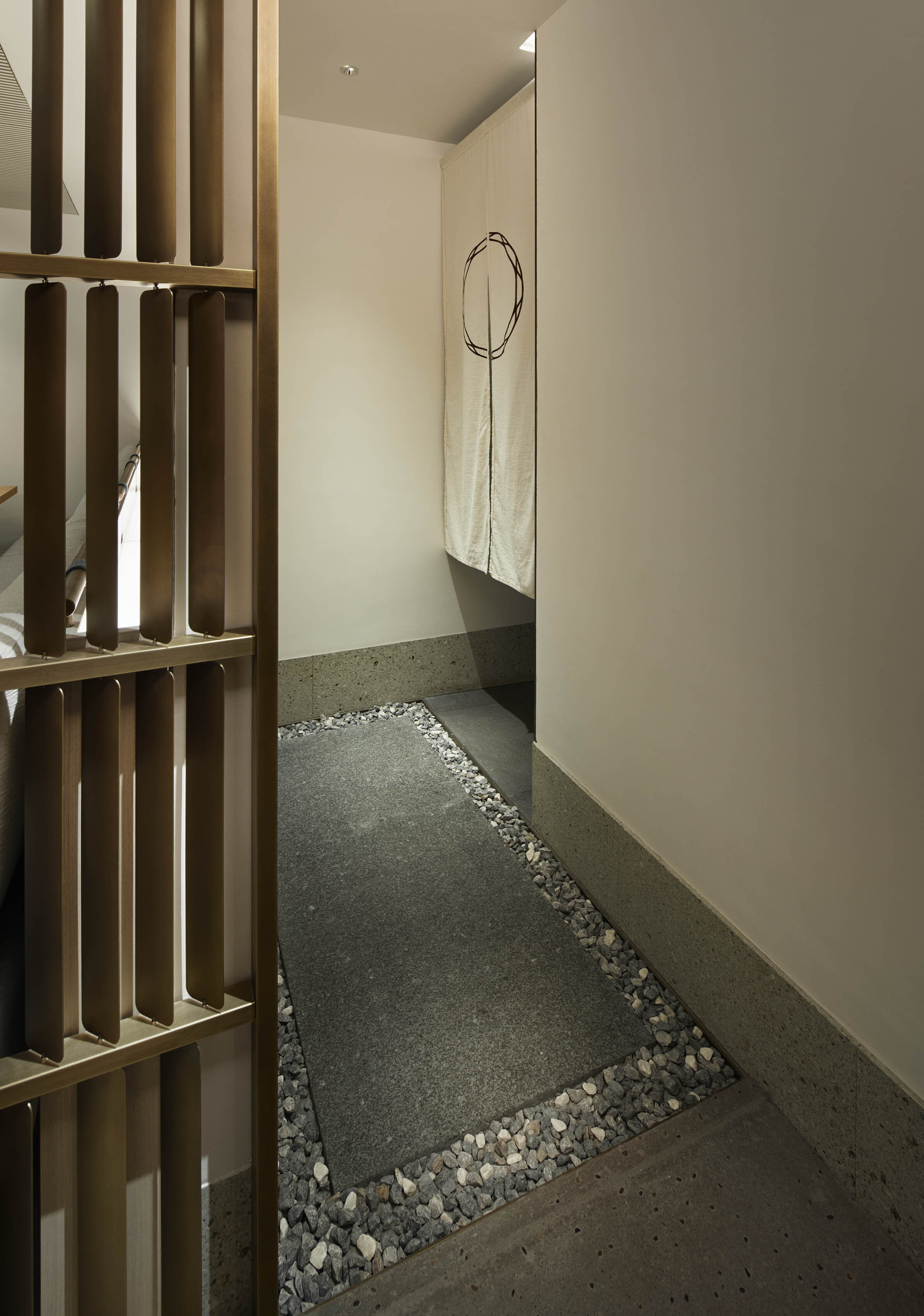
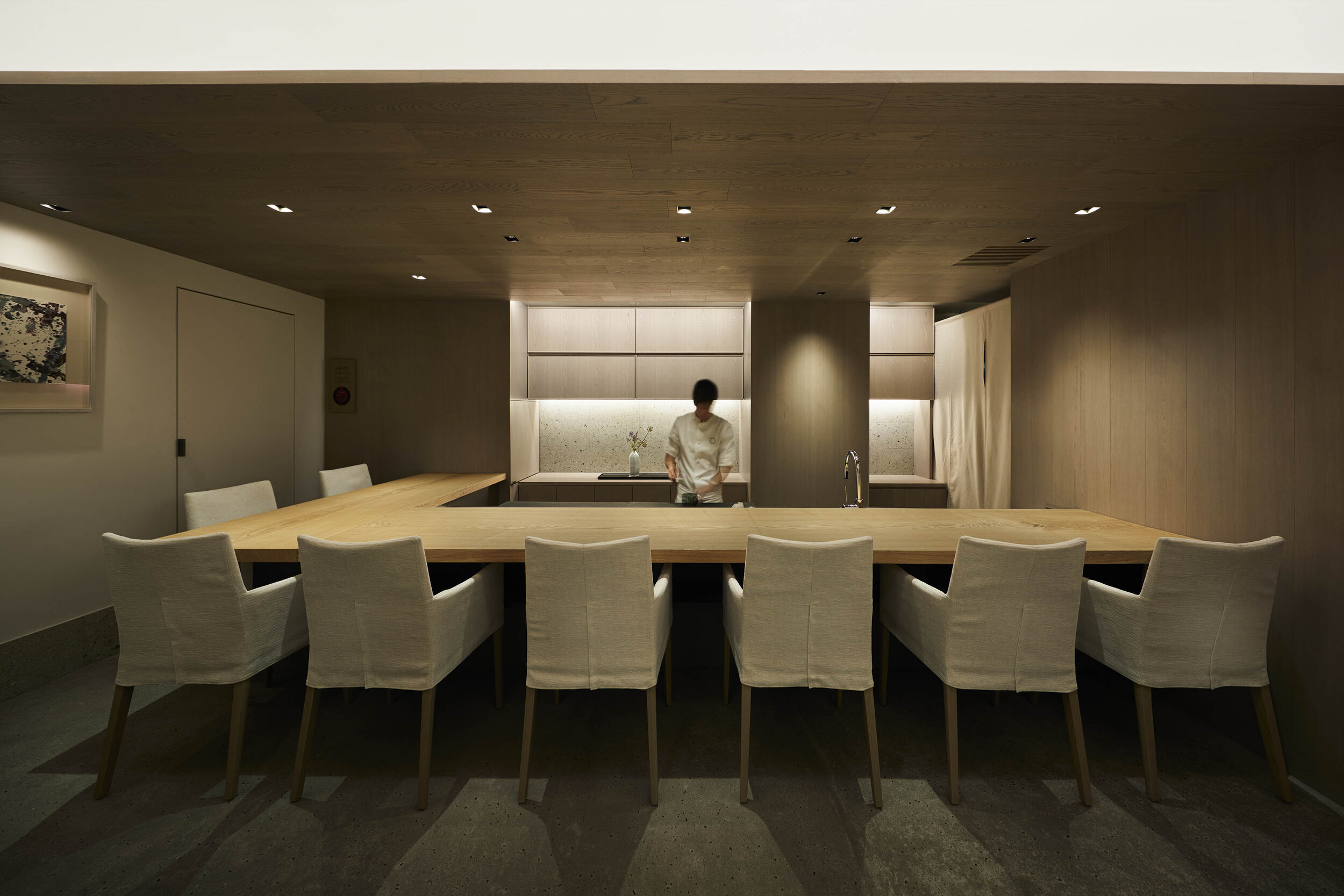
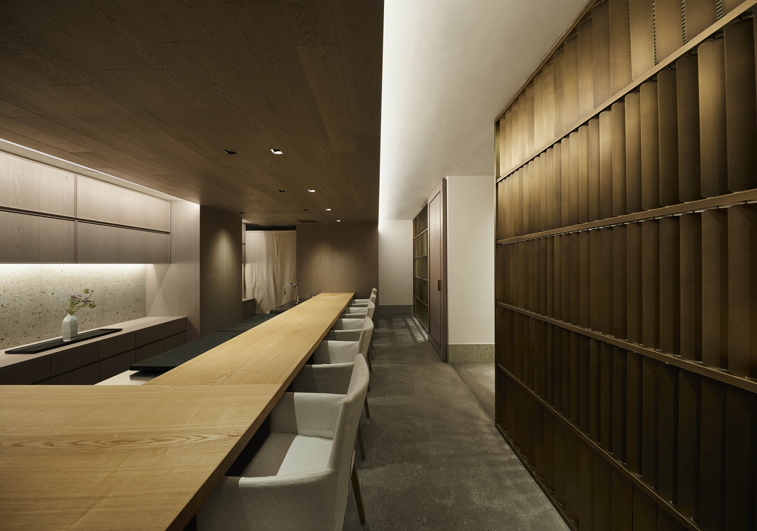
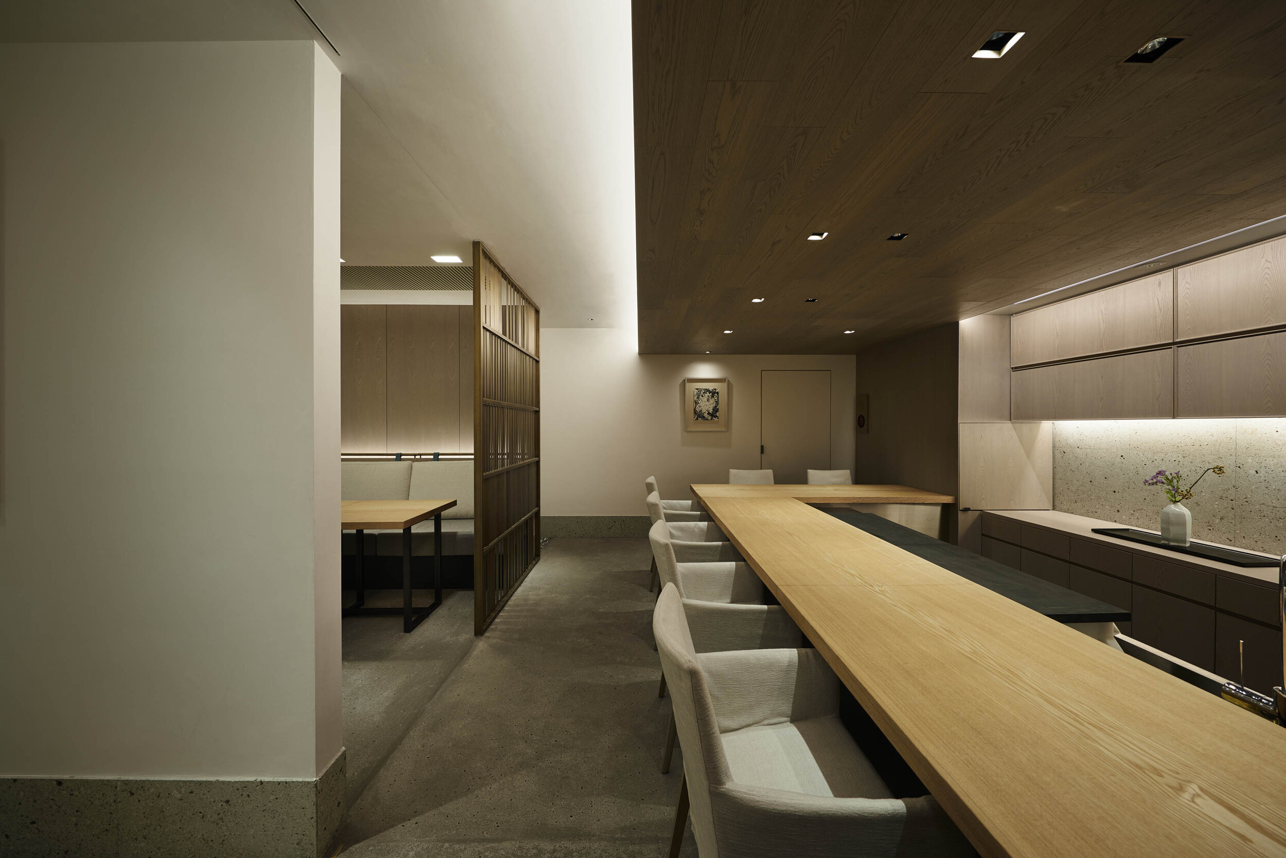
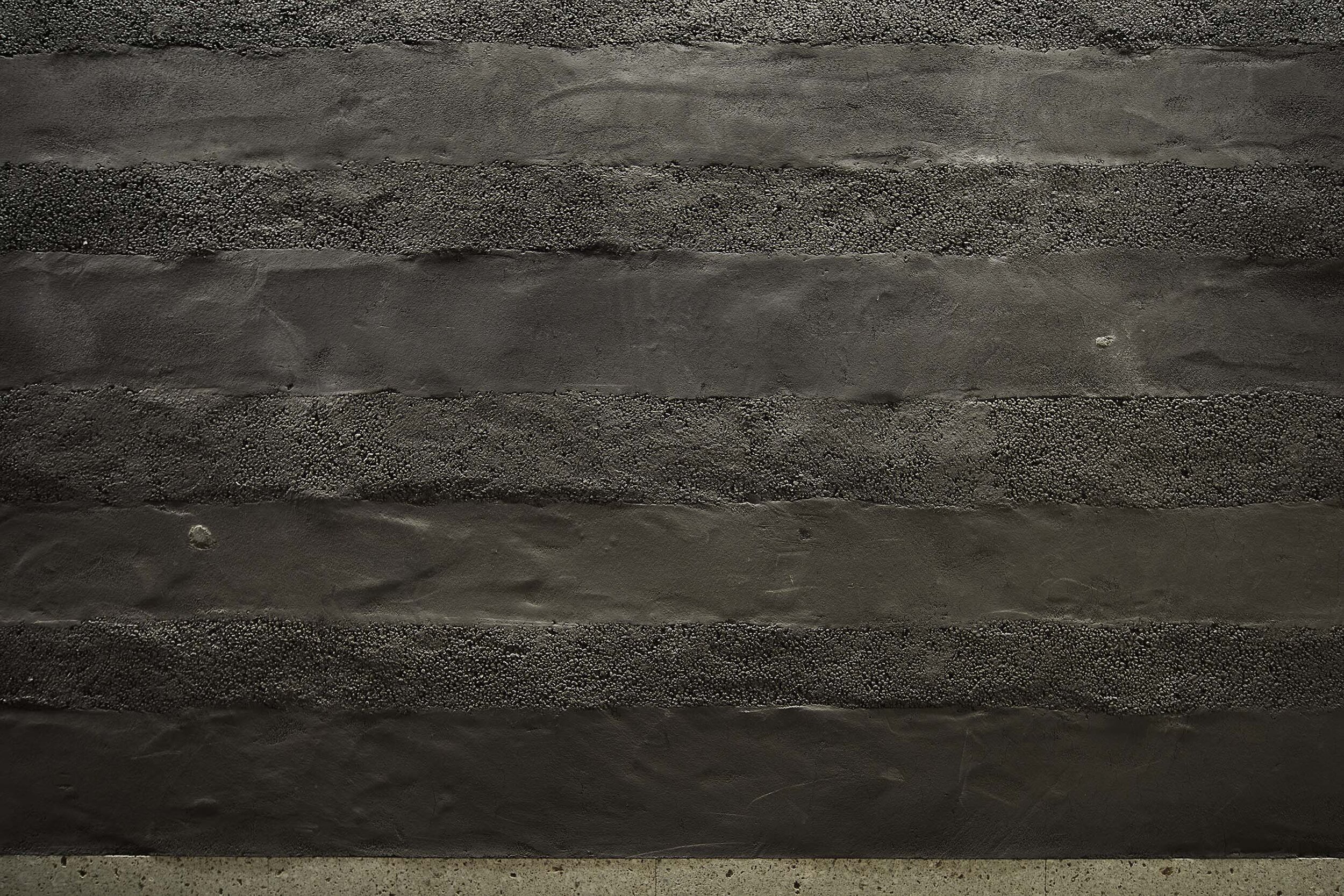
The entrance passage walls were finished with custom-made grey earthen walls having layered texture, and the floor was volcanic stone, Basaltina. They also built an L-shaped counter in the centre of the restaurant, made of solid ‘Tamo’ Japanese ash, and Oya stone wall as the chefs' background. Oya stone, an indigenous Japanese soft stone, was the only request from the client, Oku recalled.
When asked about the key to the design, she replied “We were cautious with the overall colour palette. The ceiling and some of the walls are made of veneers that have been bleached and dyed grey. Between the rooms, The design team installed custom-made steel partitions. The slats are rounded to give a gentle impression. Also, each slat of this partition can be rotated to create a blindfold.”
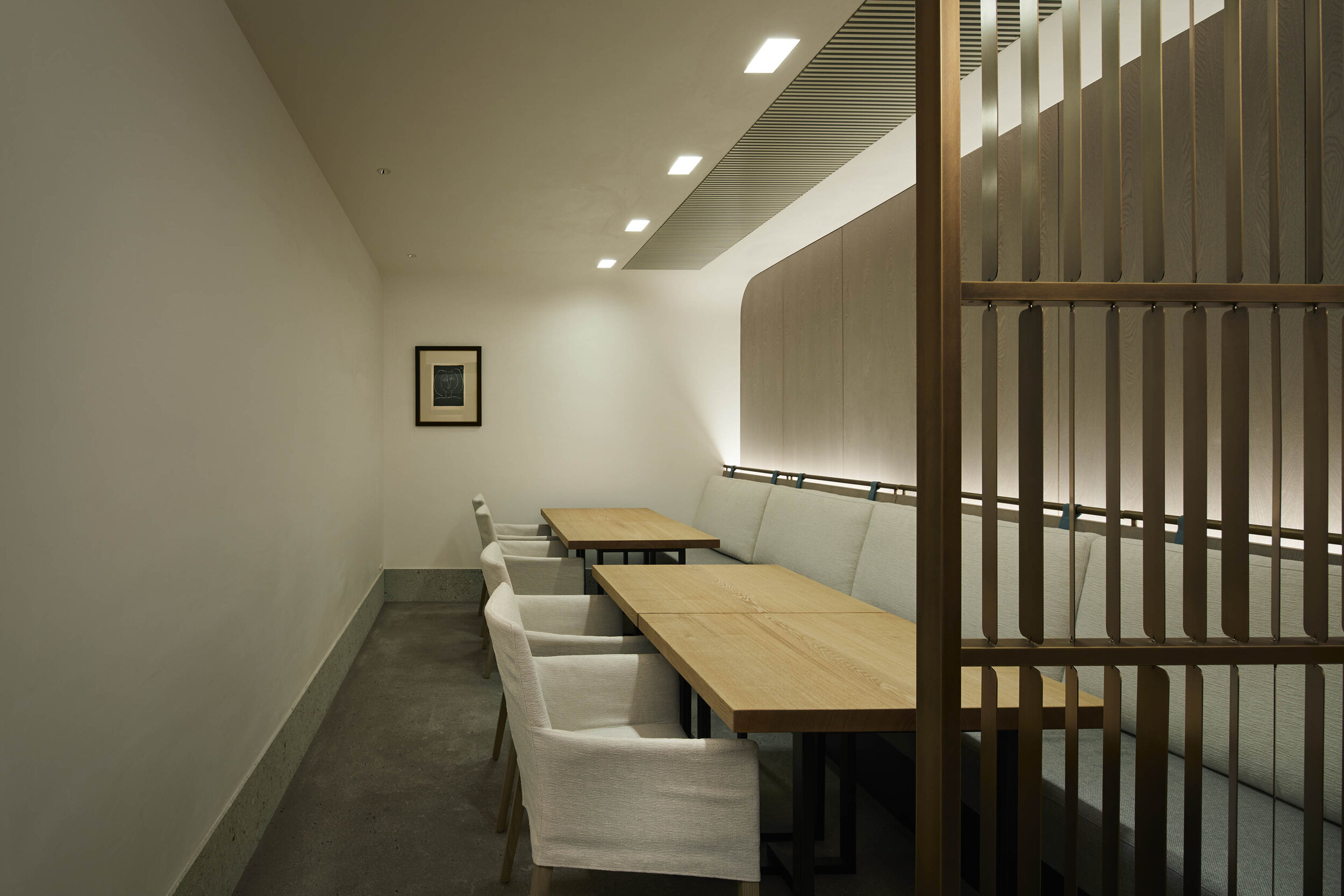
Delicate attention to detail can also be seen in the ceiling, air condition units and lighting. “To provide a pleasant dining experience for the guest, we decided to hide what was unnecessary, so They hid all the air conditioning unit in the ceiling. It took a lot of work to design, but the client was satisfied with the result. Besides, for the ceiling light, we arranged the bulbs and frames to be invisible from customers”, she explained. “Nowadays, due to cost constraints, owners often say that exposed AC systems are sufficient, but this restaurant design reminded me of how essential it is to consider every detail of fittings like indirect lighting, AC and louvres,” Oku said, referring to recent trends.
As well as the detailed ceilings, we can see her delicate design in everything the guests see or touch, such as the tables, custom-made door handles and wooden amenity boxes.
Besides, for the restaurant, Plastac designed the interior and directed the art and graphic design, ensuring a consistent atmosphere. In cooperation with Base Gallery, Picasso’s lithographs and other works that harmonise with the colour scheme have been chosen regarding the art. Regarding the art, in cooperation with Base Gallery, Picasso's lithographs were chosen for the walls and other works that harmonise with the colour scheme of the interior. As the owner is a miso (fermented soybean paste) company, a glass object in the shape of a soybean is placed at the entrance to tell the visitor the story behind the restaurant.
DETAIL

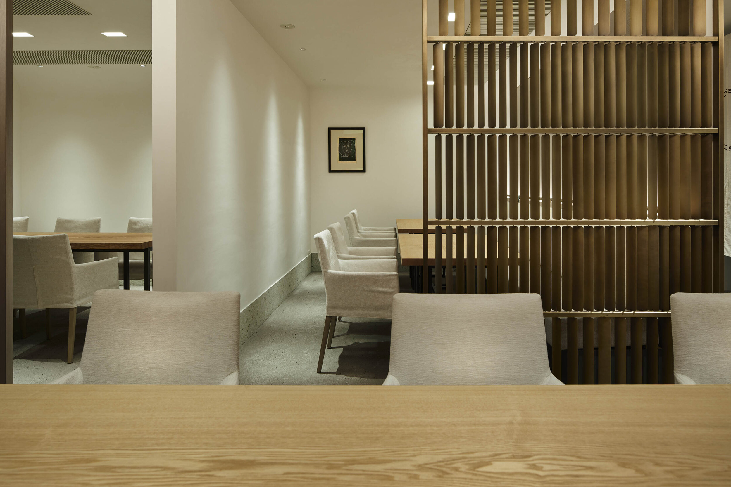
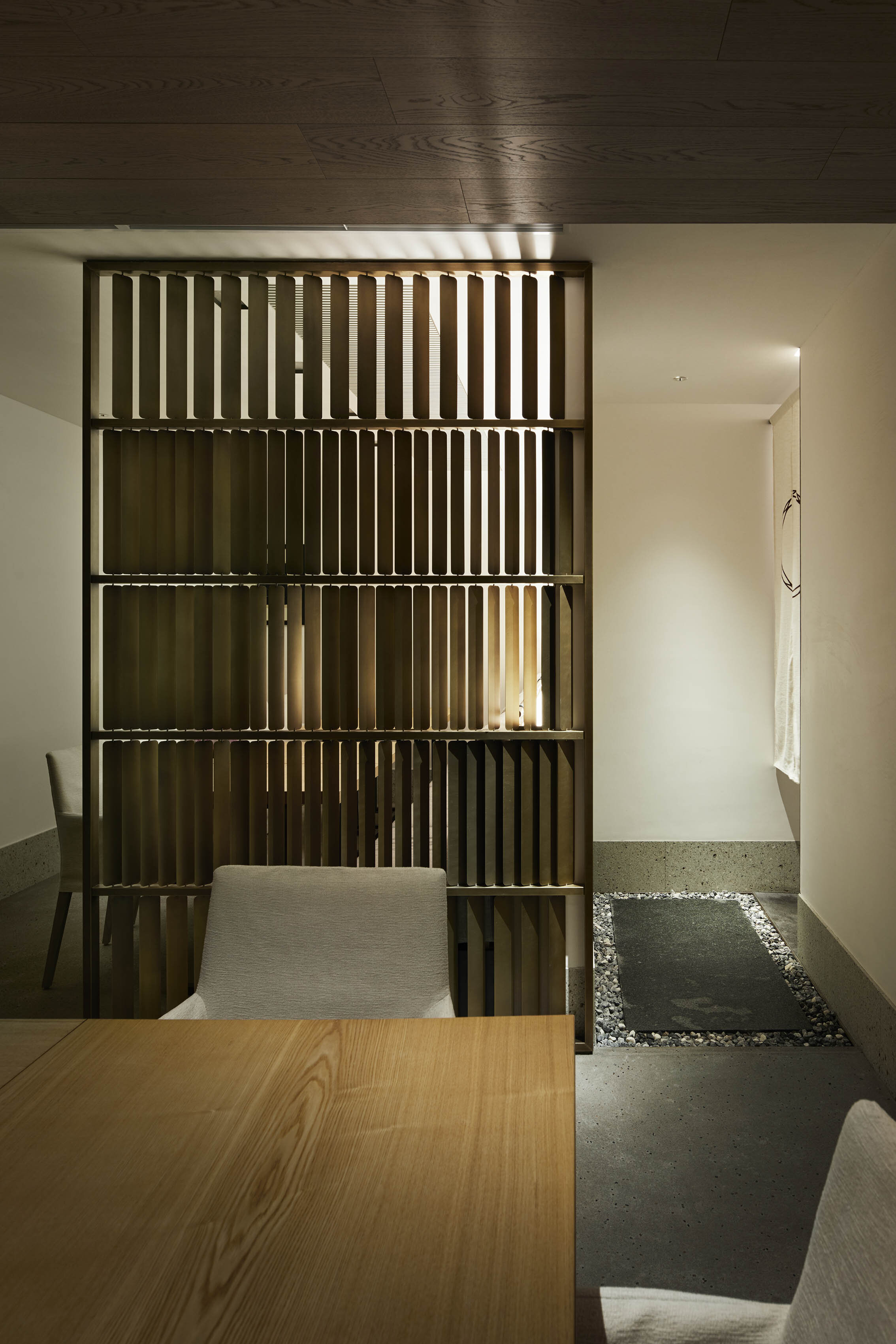
Plastac has designed a custom-made steel partition with movable slats. The middle section is densely arranged and acts as a blindfold.

The countertop is made of solid Tamo wood and the counter back is made of Oya stone.

A lithograph of Françoise by Picasso hangs on the wall above the tables. They concealed the air conditioning units inside the ceiling louvers to achieve a clean look.

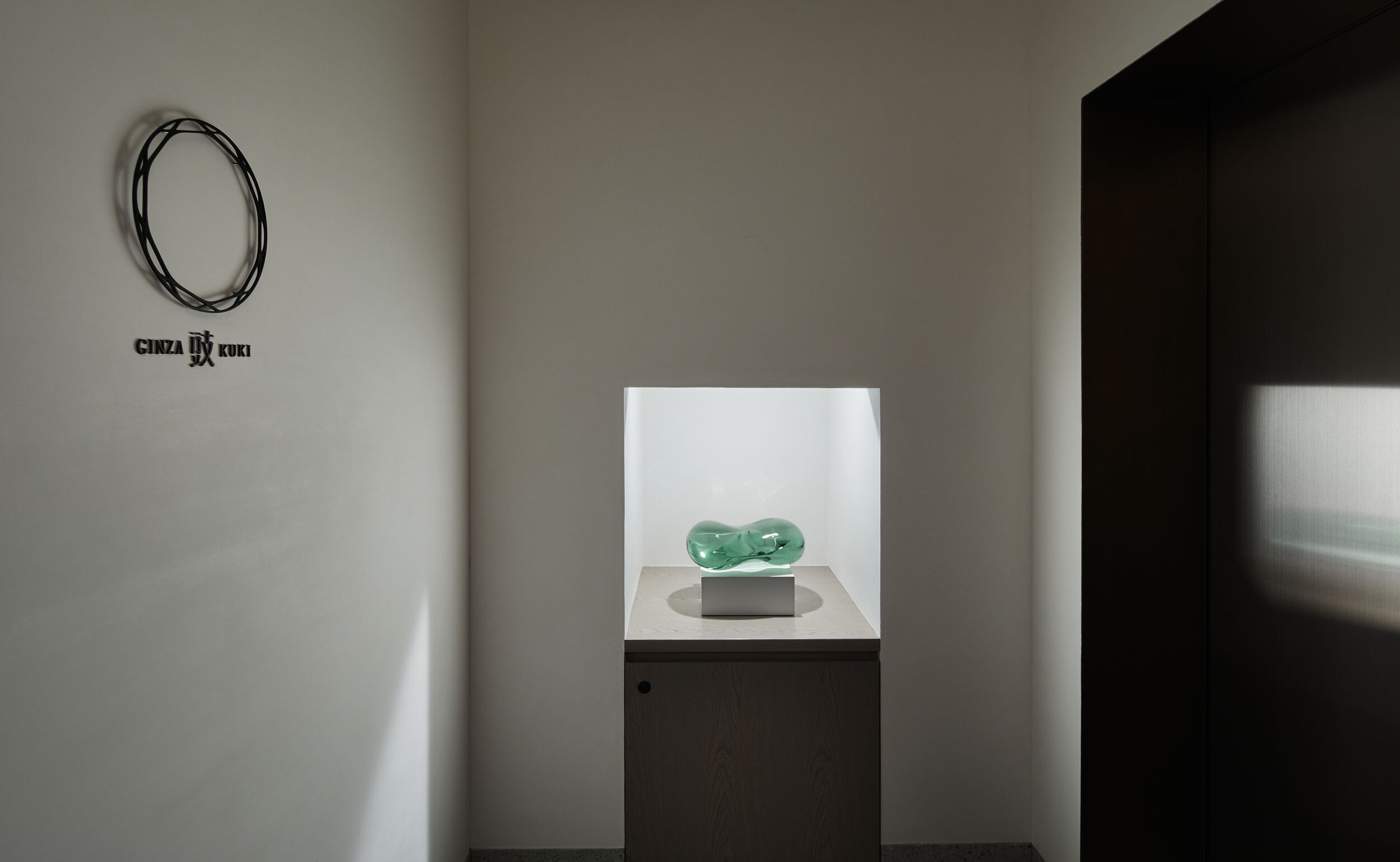
The circular symbol was inspired by a part of a traditional wooden miso barrel because the owner owns a miso company.

They installed Noren, a Japanese traditional curtain, for the entrance and the wall was finished with custom-made grey earthen walls having layered texture,

At the entrance, a glass object in the shape of a soybean was placed. The art and signage design was also directed by Plastac.

The bespoke oval mirror was inspired by soybeans.The amenity boxes in the toilets were also originally designed for the restaurant.
CREDIT + INFO
Name: GINZA KUKI
Produce: Chisako Hori
Design: Atsuko Oku / plastac
Lighting design: DAIKO ELECTRIC CO., LTD.
Sign design: ujidesign
Art: Toshikatsu Onishi / BASE GALLERY 大西利勝
Tableware: Reiko Okamoto / FCRL Ltd.
Construction: NITTEN CO.,LTD.
Location: GINZA-A5 4th floor, 5-9-6 Ginza, Chuo-ku, Tokyo, Japan
Owner: Hikari Miso Co., Ltd.
Main use: Restaurant
Completion date: 2018
Floor area: 106 sqm
Material
floor: dirt floor, Basaltina stone (waterjet finish) + pebble
wall, ceiling: plaster finish + oak veneer
entrance passage wall: custom-made grey coloured clay wall
countertop: Tamo Japanese ash t50mm + oil finish (clear)
chair: armchair (Cassina IXC.) + custom-made covering (Cassina IXC.)
partition: custom-made steel partition (patina coloured)